CSS Grid Brick Pattern
Tue Jan 30 2024

If you’re just beginning your CSS journey, I highly encourage you to study Flexbox and Grid. In my opinion, CSS-TRICKS has some of the best resources on Flexbox and Grid. These powerful tools are used to create and control the layout of elements on a webpage. It’s a bit of an oversimplification, but when learning, you can think of Flexbox as being for one-dimensional layouts and Grid for two-dimensional layouts.
What are we making?
In this post, I’m going to show you how to create the brick-like pattern I use to diplay blog cards on the desktop version of the blog index page of this website. In case you’re on mobile, here’s what it looks like:
Achieving this is pretty straightforward except for bit of CSS math.
The HTML
We’ll need a wrapper div and any number of child elements.
<div class="wrapper">
  <div class="card"></div>
  <div class="card"></div>
  <div class="card"></div>
  <div class="card"></div>
  ...
</div>
The CSS
Here are the key styles for the wrapper element.
.wrapper {
  display: grid;
  grid-template-columns: repeat(3, 1fr);
  /* ↑ equivalent to ↓ */
  grid-template-columns: 1fr 1fr 1fr;
}
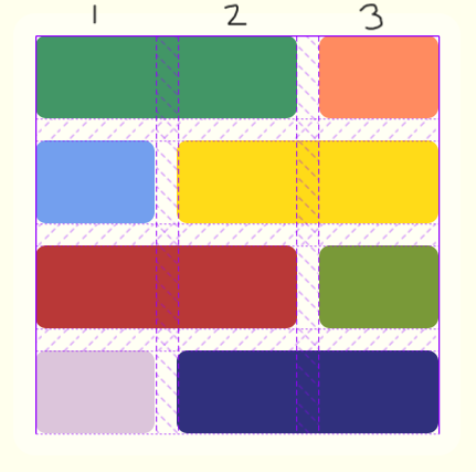
Obviously, we need to set the display property to grid, but less obvious is that we need a total of three columns. I’m using the fractional unit fr to specify that I want three columns of equal width, but any unit will do. The simplest way to explain why we need three columns is to open up the developer console and inspect the grid layout. This is what it will look like:

Notice that some of the elements span across two columns, while others only span across a single column. By default, all grid children take up exactly one column and one row. To override this, we can use the css property grid-column, which we set on the child element.
.card {
  grid-column: span 2;
}
The tricky part for me was nailing down the pattern for setting this property only on the right child elements. By going through and counting each element, I figured out that I needed to set grid-column: span 2 on every fourth element starting from zero and one. We can achieve this with vanilla CSS using the :nth-child() pseudo-class and its functional notation.
.card:nth-child(4n) {
  grid-column: span 2;
}

.card:nth-child(4n + 1) {
  grid-column: span 2;
}
:nth-child(4n) selects every fourth child beginning at zero and :nth-child(4n + 1) selects every fourth child beginning at one:
If it looks a lot like
y = mx + bthat’s because it is!
n = | 4n = | 4n + 1 = |
|---|---|---|
| 0 | 0th child | 1st child |
| 1 | 4th child | 5th child |
| 2 | 8th child | 9th child |
| 3 | 12th child | 13th child |
| 4 | 16th child | 17th child |
Here’s the whole CSS block, nested:
.wrapper {
  display: grid;
  grid-template-columns: repeat(3, 1fr);
  .card:nth-child(4n),
  .card:nth-child(4n + 1) {
    grid-column: span 2;
  }
}
I hope you found this interesting! Have fun playing around with different values for column width or adapt this code to work for more than two visual columns!
View the MDX for this page or submit an issue if you noticed any errors!